Prologue
In this article, I will talk about Auto Layout in iOS (Swift 3). It is a basic skill for iOS development nowadays. This article will be not very complicated, but very easy to understand. I will give you the code at the end of this article. Besides, you will know how to use storyboard to make Auto Layout.
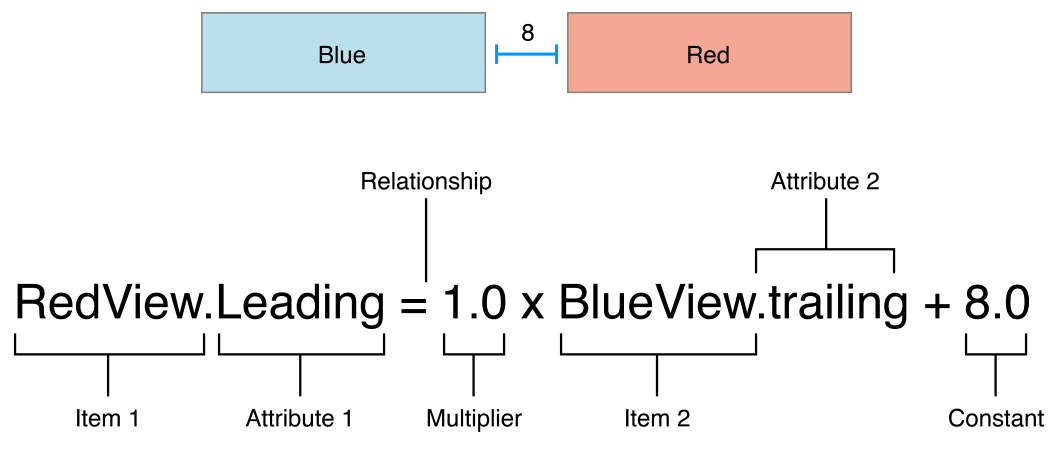
Apple’s Auto Layout Guide is a great document to read. The below’s equation is a very useful guide. For more detail, please visit: Anatomy of a Constraint.
This constraint states that the red view’s leading edge must be 8.0 points after the blue view’s trailing edge.
Auto Layout for a Calculator
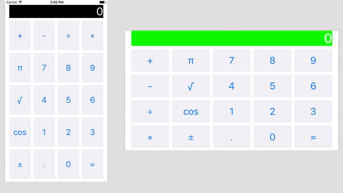
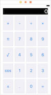
Today, I will implement this kind of user interface which showed on below. It is a Calculator, I will focus on how to make constraints for this UI, instead of how to calculate. I will show this code sample at the end of this article.
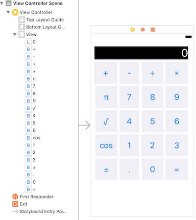
Step 1 Put all needed buttons into Storyboard
Just put all of this buttons and a label into storyboard.
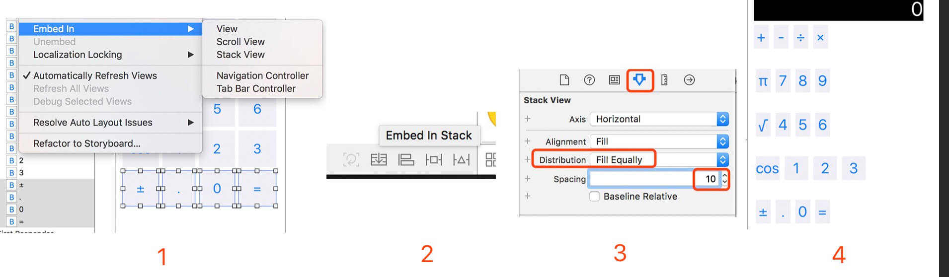
Step 2 Enbed In to Stack View
There is a great video to talk about why we should use the Stack View: Mysteries of Auto Layout, Part 1.
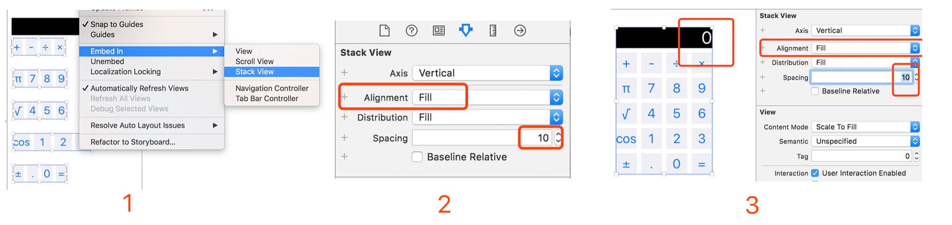
- 4 buttons as a line and choose them, then click
Editor --> Enbed In --> Stack View(or you can just click right bottom’sEmbed In Stack View). - Click the
Show the Attributes inspectorand selecteDistribution'svalue toFill EquallyandSpacing: 10. - Do the same thing with others buttons to the stack view.
Finally, we will get this the last picture showed on the screen. It’s not finished. All of these steps showed on the below picture.
Step 3 Continue to Enbed In
Combine all of views into stack views
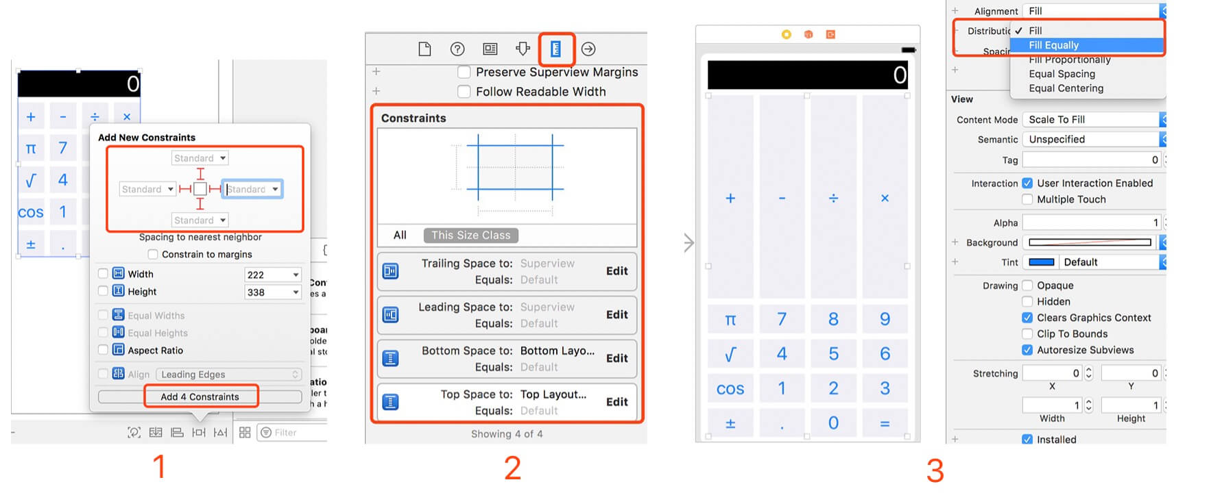
- Select these five buttons lines (
+-÷×,π789,√456,cos123,±.0=) and Embed In to a Stack View, set it’s attributes to:Alignment: Fill,Spacing: 10.(Picture 1, 2) - Continue to select to both label and buttons’ stack view and Embed In to a Stack View, set the same attributes with above. (Picture 3)
Steps instructions show on the blow:
Make the outside stack view match to the screen
In this step, we will set our calculator fit into our any devices.
- Click the
Add New Constraints, which located in the right-side bottom of Storyboard, then choose all four directions line to hightlight and set the vaule toStandard, ClickAdd 4 Constraints.(Picture 1) - Click
Show the Size inspector, we can see what’s kind of constraints we already set:Trailling,Leading,BottomandTopto theSuperview.(Picture 2) - But we got a problem, The first line buttons (
+-÷×) is not the same with our expection. Select all buttons stack view(including all buttons stack view but not include label), and then set theDistribution'svalue toFill Equally, which can solve this problem.
Fianlly, we have got this kind of view. It already match our requirements, which can showing on all devices.
Make it more easier to use
In following steps, we will talk about how to make it to fit different orientation, both height compact and width compact.
Step 4 Height compact style
OK, that’s fine for above code, but if users want to change some buttons position when they rotate their screen, how to achieve this? (Just like this article mentioned at start) It means this calculator will become five columns instead of four columns when I rotate the screen.
Do some pre-work for Height Compact style
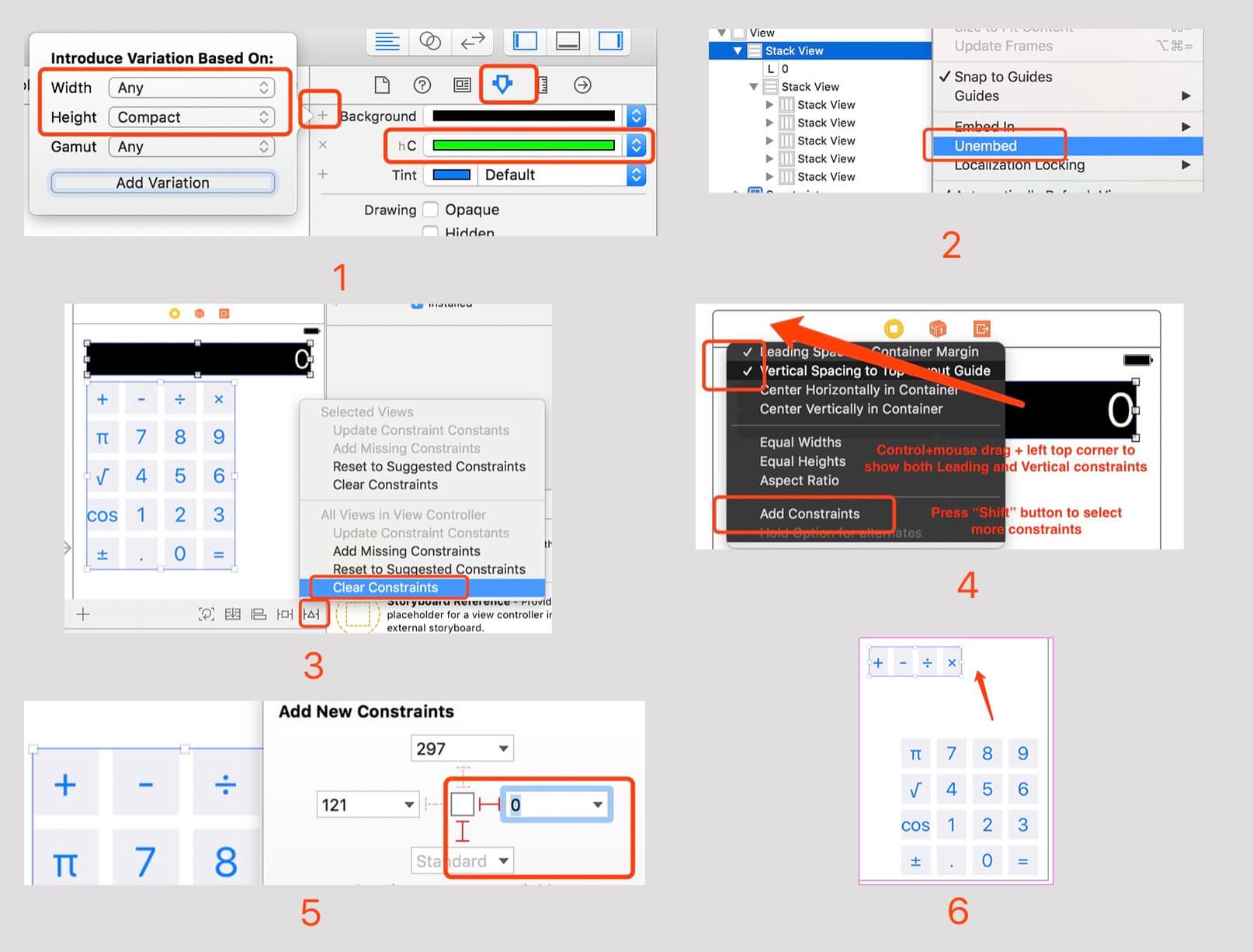
Firstly, I want to introduce some attributes for every view. On the below (Picture 1), there is a plus mark for Background. It means when Height is Compact, the background color we set it to green, Height compact means height’s value less than width’s value (Screen’s orientation is horizontal).
Then, we continue to our steps:
- Make top’s stack view
Unembed, which means remove this stack view (Picture 2) - Select both label and buttons’s stack view, click
Clear Constraints(Picture 3) - Select label, and press control keyboard and drag mouse to the left-top corner, press shift to select both
LeadingandVertical Spacing.(Picture 4) - Select buttons stack view, make the constraints to left-bottom corner and values are
0andStandard.(Picture 5) - Drag out first line buttons from buttons stack view, and Command+X to Cut it.(Picture 6)
Height Compact style set 1
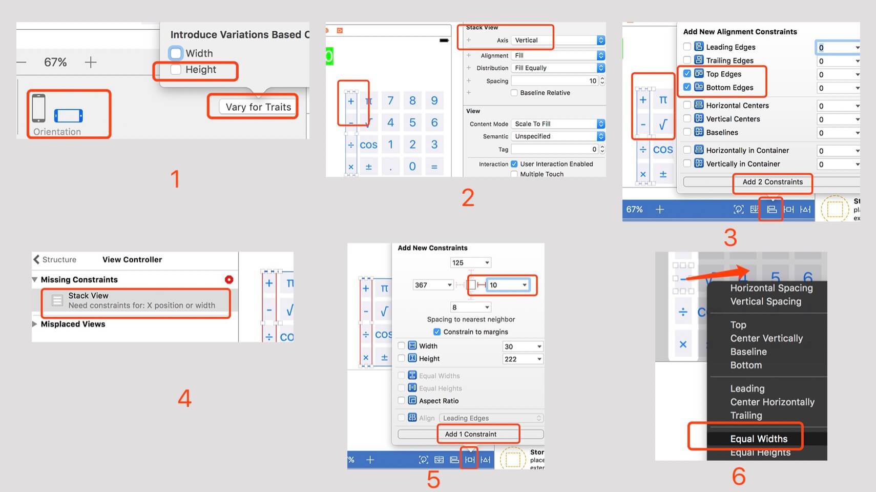
- Click
Orientationto thehorizontaland clickVary for Traits, then select theHeightintroduce variations. This step is for setting our view to Horizontal model, so that it will be different with vertical model.(Picture 1) - Command+V to paste the buttons(
+-÷×), set itsAxis: Vertical, and put it into this side.(Picture 2) - Select both two button’s stack view and then click
Add New Alignment Constraintsto set theTop EdgesandBottom Edges.(Picture 3) - Then you will see a error tips:
Need constraints for: X position or width, because there is no constraints for the stack view(+-÷×).(Picture 4) - Select this stack view(
+-÷×), add a new constraint for it.(Picture 5) - Drag one of the stack view’s button to the right buttons’ stack view and set its attribute to
Equal Widths.(Picture 6)
Height Compact style set 2
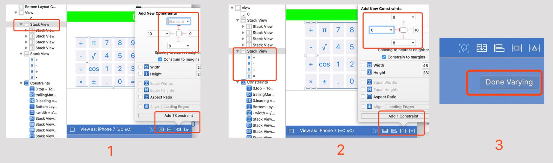
- Select right-side buttons’ stack view, and add new constraints to
Top Space to 0.(Picture 1) - Select left-side buttons’ stack view(
+-÷×), and add new constraints toLeading Space to SuperView.(Picture 2) - Click
Done Varying.(Picture 3)
Step 5 Width compact style
I wound not tell you how to do it when the user interface style is width compact, because the steps is almost same with above. But there are some things, you need to know:
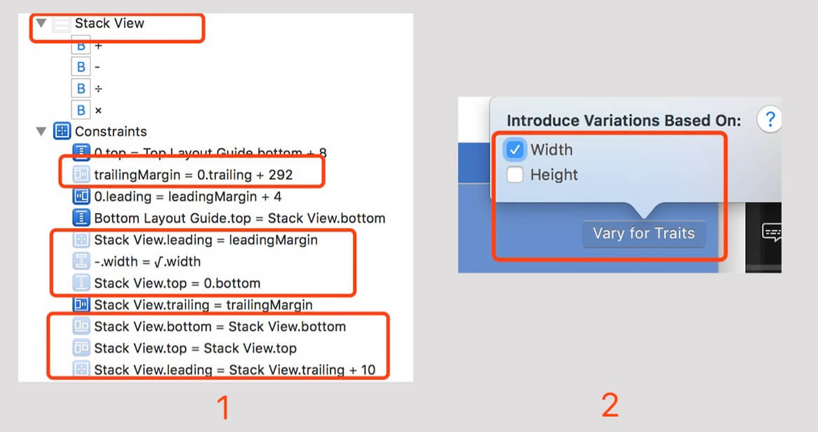
- When you click
Orientationback to thevertiacal, (Picture 1) shows some unusable attributes, which means they are not used in this orientation. - Set style for
width compact, you need to setVary for TraitstoWidth.(Picture 2)
You also need to know the stack view(+-÷×) is not exist on this orientation, because it is unusable, so you need to copy that unusable stack view to this orientation, be careful, there is some little tricks. :)
Postscript
Code Sample: Calculator-demo-Swift
Learn from: Stanford University - CS 193P iPhone Application Development